How to improve website design using colors.
Here I will try to describe how colors can be successfully used to affect our life, and how you can use that knowledge to influence your website visitors decision making.

Different colors meaning in western culture.
Let’s kick off with something really basic. Here you will find a little cheat sheet for meanings and associations of colors (note that these are relevant to western culture, just to keep it short 😉 ):
RED – stands for passion, love and desire. It’s associated with danger, strength, fire, energy… It’s often used to grab attention & encourage emotional reaction. Perfect for cars, sports sites, often used in food industry as it stimulates appetite. Avoid for finance sites.
PINK – most of the time used to advertise and sell products to women and young girls. It expresses femininity, sweetness & finesse.
ORANGE – color of joy, happiness and creativity. It’s very eye catching so it’s often used as base color for call to action buttons (as it attracts impulse shoppers). Don’t overuse this color as it’s suggest cheapness.
YELLOW – in western culture it’s often connected with happiness, warm feelings, optimism and cheerfulness. Good to go when you need to catch attention.
GREEN – Color of nature, wealth, balance and harmony. It’s strongly recognized for it’s calming effect as it’s really kind for the eyes.
BLUE – color equally preferred by both genders. It creates feeling of stability and trust. Often used by banks, real estates and health institutions.
PURPLE – it symbolizes luxury, ambition and power. Since this color is very rare in nature it also associated with mystery, magic and extravagance. It’s often used to advertise products for women and children. It’s perfectly suited for beauty & fashion, technology, education. Avoid using in food industry.
WHITE – it’s perfect color used as a base for eCommerce since it help products to stand out. Don’t be afraid to use white space if you want to create information friendly environment. It brings feeling of safety, purity and cleanliness, therefore it’s often used for medical websites.
BLACK – stands for luxury, wealth and sophistication. It is considered to be very elegant but also mysterious. You can safely use it as a background to photography portfolio as it will help your pictures stand out.
See more: Most Important Design Elements and Principles You Should Know
This simple list can give you an idea on how to choose colors to attract specific group of customers. Take time and try to figure out which color will best correspond with philosophy behind product or service you want to sell. If you’re not sure questions below may be off use for you:
– what kind of age groups you are aiming at?
– do you wish to sell your product to a specific gender?
– which of their feelings do you want to engage?
– do you want to trigger a specific emotional response?
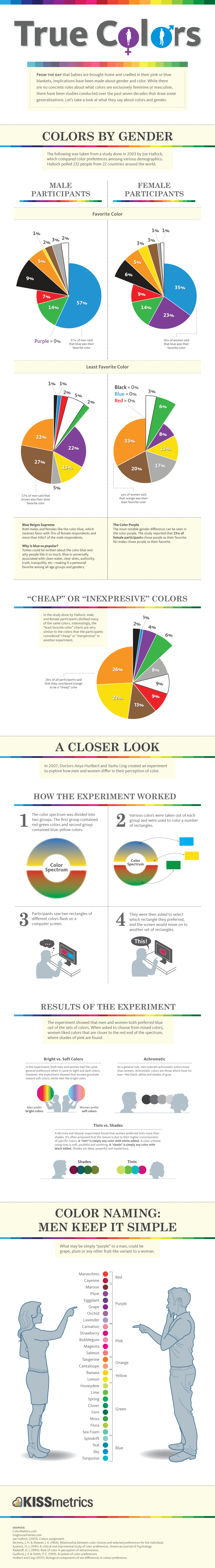
Let me set up a simple example. Let’s say, you’re an owner of a gym. Obviously you want your business paired with energy, encouragement and motivation. Red is definitely the best color to choose. Not only will help you achieve desired reactions, it will let you reach a wider range of consumers. Studies show that red is equally liked by both genders in different age range. This diagrams may be a good starting point on getting to know people preferences when it comes to color:
Of course, color psychology is not set in stone. Remember that color is something that people will classify through their own experiences and feelings. Rethink your strategy, mix it up with color and use it to your advantage. Just make your choices purposeful and fit them in an appropriate context. Don’t pick your colors at random and you won’t end up harming your product. If you’re not very confident with your color coordination there are many tools that can assist you with this task. I will introduce them to you in the end of this article.
Choosing colors for your website.
Now you have the basic understanding of how different colors can be perceived. But it still isn’t enough. You cannot just make all of your site red, it wouldn’t make sense. There is a rule of thumb that says you should pick no more then three colors for your website: dominant & accent color. Additionally you will have to pick corresponding background color.
Dominant color.
Remember to use your dominant color only in places where you want to draw attention. You don’t want to abuse it and use it all over your website. Highlight only important information which can be crucial for visitors.
Accent colors.
You want to use accent colors to emphasize on certain elements (such as badges, sales banners & call to action buttons). These will be important but not as significant as dominant color. Remember that you shouldn’t clutter your website with to many accent colors. You can easily create chaos and confusion. Keep colors number low and you will be able to smoothly navigate your visitor throughout the entire page. The eye will naturally follow where it needs to go.

Background color.
It’s not reveling but it has to be said. Color of the background also depends on purpose of your website. Just like you shouldn’t choose pink to decorate walls of a funeral house you shouldn’t pick orange as a base of wellness & SPA website. I bet your instincts say that some kind of pastel blue or green would be a much better choice and yes, you’re right! But there is so much more to it.
Your use of background color may vary depending on what story you want to tell. Let’s say you’re aiming to create a strong, memorable brand. In this case you should consider using different shades (darker) or tints (lighter) of dominant color and use them consequently on the entire website. To do that keep adding black or white to primary color and eventually you will end up with good colors combination.

Moving forward to creative websites. These are wild! Both, graphic and color intense. You are allowed to do almost anything. As long as text on the website is readable and your content somewhat visible of course. Just remember that you still want to keep your visitors comfortable, so at least try to find some rules in this creative madness.
On the contrary – eCommerce or corporate sites are begging for light, discreet backgrounds. If you want to focus visitor’s attention on a product or service simply use white or something similar. I can assure it won’t compete with your content. Use white space wisely and your design will become content-centered 😉

Helpful tools for creating a color scheme.
Enough theory, time for action! As promised above here are some tools which will help you in creating beautiful color schemes.
1. Adobe Kuler

Probably the most recognizable tool out there. It’s remarkably handy and allows you to instantly use created color schemes in other Adobe apps through Creative Cloud Library. It’s a good place to start when you’re looking for inspiration since you can browse community works.
2. Color Hexa

If you love to mix creativity with a bit of learning you may want to visit this site. It gives all kind of information about selected color: color conversion, alternatives, shades and tints, contrast preview and even color blindness simulator. It’s definitely a page worth visiting.
3. HTML Colorcodes

Easy to use, and very keen on the eyes (unfortunately may be a bit heavy for a browser, I’ve encountered few cases when my Chrome stopped working). How is it different? It creates slightly more color options for your pallet. Also export includes classes with values for CSS.
4 . Colourco.de

If you are a hardcore coder (you don’t really have to be 😉 ) you can check out It’s a little bit specific, but when you get used to it you can achieve diverse results. Moving your mouse up/down literally adds black and white to primary color. As a feature possibility to export scheme to SCSS & Less.
If you’re not sure where to start and you’re idea for color on your site is just “Well, you know… blue” try these sites: https://colordrop.io/, http://www.palettable.io, http://www.flatuicolorpicker.com/ Maybe something will catch your eye and you’ll be one step closer to using colors purposefully and more confidentially. I can assure you, (and probably every other designer will back me up) when done right advantage is undeniable.

Since everybody in our design team loves http://www.palettable.io/ and we love our readers even more, we’ve came up with a little contest. Send us a link to a color pallet you’ve created e.g. http://www.palettable.io/52ACCB-F4F4DE-C0D2D9-ED126F-E4717A to malwina.p@wordpress-1101745-3860470.cloudwaysapps.com
and we will choose two color schemes that will strike our hearts. Lucky winners will get 15% off an order on wpkraken.io. You’ve got time till 16th November.
Good luck & may the color be with you!


